Solo Project
Overview
Introduction + The Problem
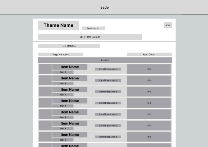
Bricklink is a site designed exclusively for LEGO resale. It is immensely popular among collectors, including Nick himself. While the site has a reliable user base, the outdated UI is undeniably overwhelming for both returning and new visitors. Bricklink is absolutely plagued by large chunks of small text, along with confusing button designs and placements.

Goals
Nick aimed to rework Bricklink to be far more user friendly, while still maintaining the current appeal of the website. At the same time, as a regular visitor of Bricklink, he wanted to be sure that his changes did not come at the cost of neglecting loyal customers.
Process
Because he is a regular user of the site, Nick made sure to often check in with peers and professors before finalizing large changes. While all the work done on the site is his own, user tests and feedback were very important in achieving his goals for this project.
Development
Solving the Problems
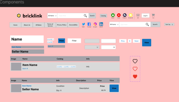
With this project being Nick’s first website redesign, he was introduced to many conventional design choices along the way. These conventions worked quite well when applied to Bricklink, bringing the site one step closer to being more user friendly. As for the overwhelming blocks of small text, Nick redesigned them to resemble the gallery menus seen on current pages of Bricklink.
Workflow
As mentioned in the overview, Nick made sure to take advice from his professors and peers. After independently working to refine a low fidelity wireframe to his own liking each week, he would review the page with a professor seeking advice, refining the page between each week. This would repeat for some weeks, until both parties were satisfied, at which point Nick would check in with his friends. He would then take all of this feedback and make his final adjustments before reviewing with his professor one last time before finalizing the design.


Evolution
This project has spanned several months and is still a work in progress. In this time, Nick has become much more experienced in the world of web design. Some of his biggest changes are actually the most subtle, as he has learned where small adjustments can make a world of difference in usability.
Results
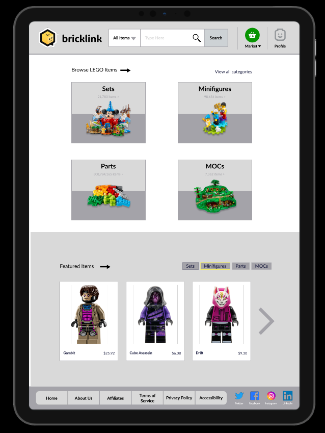
Final Product
Nick’s new design of Bricklink fixes issues that have gone unresolved for years. He has also managed to give the site a facelift that builds much more harmony and a consistent design language between different pages.
Reflection
Nick is quite pleased with how the project turned out. His redesign went through many revisions, requiring many different angles and creative methods of thinking, which he believes have helped him improve as a designer.
Images/Videos


Leave a comment